Uber Movement
The goal of Uber Movement is to provide data and tools for cities to more deeply understand and address urban transportation challenges. At its core, our team believes that working with cities to improve infrastructure side-by-side is the future.
After joining the team, I focused on a few questions:
- Who is interested in this? Who are we targeting (and why)?
- How does this impact our business? What’s our business model?
- How are we measuring success?
What’s the business problem
City and state governments generally view Uber unfavorably and as something to be taxed rather than celebrated. This hurts our business in the form of taxes, fees, and litigation (representing 2% of US GB). Cities and local and state governments can also choose whether or not we operate in a market. Last year we lost our license in London, one of our top markets in the world, due to a “pattern of failures.”
How do we fundamentally change our relationships with cities to ensure marketplace health and longevity?
We understand we’re held to a high bar, as we should be. But this TfL decision is just wrong. Over the last 2 years we have fundamentally changed how we operate in London. We have come very far — and we will keep going, for the millions of drivers and riders who rely on us.
— dara khosrowshahi (@dkhos) November 25, 2019
Cities as a customer
In the beginning, the core customers of Uber Movement data (Travel Times was the sole data product at the time) were academic researchers and tech-savvy urban and transportation planners. We relished the idea of having free, rich data for the world to download and discover new insights with. But we also wanted to more directly impact city infrastructure by working hand-in-hand with planners. This ended up being more difficult than we anticipated due to bureaucratic obstacles and our less-than-ideal reputation. This year we are reassessing this goal and going back to the drawing board with new ideas and strategies.
It’s not surprising that cities love data. They can’t get enough of it. They want data even if they don’t know what to do with it. Data is expensive… But they’re willing to pay for it. Cities often pay agencies and 3rd parties massive amounts for accurate and reliable data to power their planning decisions. For planning SaaS and products, it’s millions of potential revenue. What we’re trying to figure out is who we can successfully partner with to make this happen. Is it the federal level? The state level? Or the city and local level? Should we focus on government customers or should we broaden our net to large orgs and non-profits? Who will gain the most value from our data?
Given all of our questions, our immediate goal was to be opportunistic; work with as many current and new customers as possible so that we could establish a benchmark. This list included researchers, urban and transportation planners, city committees, local governments, transit agencies and more. Clearly there are many cities interested in the insights our data can provide. But our blanket customer experience won’t take us very far with our specific set of goals. Today we are still learning about our customer opportunities, especially given the unique circumstances and needs during COVID-19. Cities are relying more on our services now than ever. And we want to show up for cities.
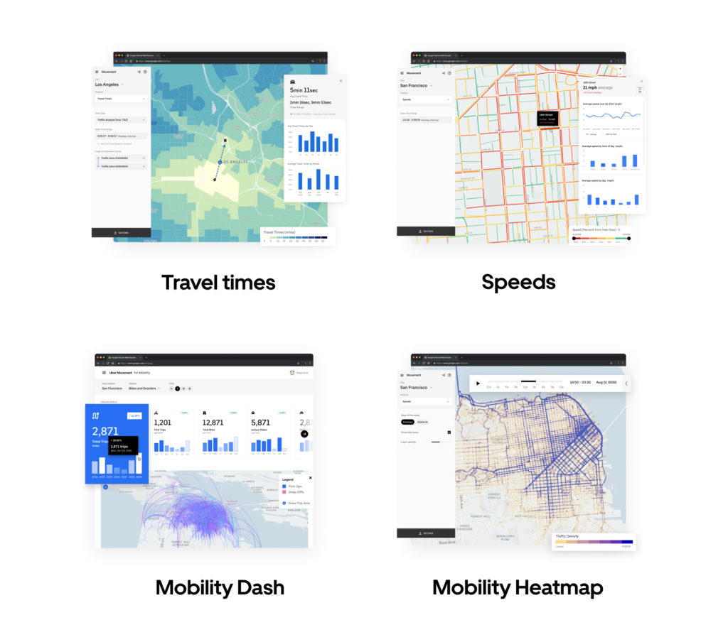
Product suite
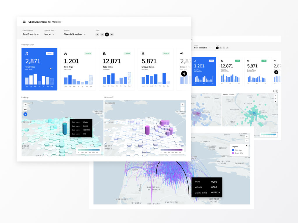
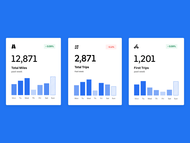
The first MVP I launched was the new mobility dashboard (requires private access), which was a pivotal step towards helping regulators, planners, and city operators understand the activity of bikes and scooters in their city via key metric and geospatial data. Having launched a very simple MVP in a matter of weeks, we were surprised by the positive feedback we received from our users. The new mobility dashboard took us into uncharted waters (custom dashboards, new customers, real-time data etc.), but in the end it turned out to be a good bet and spun off a lot of internal cross-org collaboration and external city relationship building.
New mobility dashboard MVP
Eventually we found the dual geospatial maps, which represented the two data points (pick-up and drop-off, aka PuDo), to be a lesser experience. I advocated for merging them into one map – the tricky part was figuring out the interaction pattern of how a user drills down into the hexagon to get both parts of the data. Later we released a merged map and an improved drill down experience as well as a new modular framework for these dashboards.
New mobility dashboard
In Movement Speeds, for the first time ever we were able to map speed data to individual street segments (which is currently the only universal measure of roads), achieving the highest granularity yet. For more info about this dataset, you can view our methodology paper or read about it here.
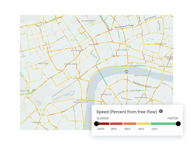
The core goal of Speeds was to empower planners to analyze congestion better: pinpoint choke points, identify unsafe streets for pedestrians or bikers, or understand congestion patterns as a whole. Our experimental goal was to unlock other use-cases, alongside our other data products, that could present new perspectives for solving congestion or safety in a city (or perhaps another use-case we didn’t know about yet). A big part of this process was soliciting continual feedback from several city partners and showing them prototypes and designs. From the feedback, we found that users often are looking for extremes and anomalies in their analysis. This feedback informed many features. For example, on the map legend you can see two black circular handles – these handles allow the user to focus on speeds they’re interested in while eliminating noise.
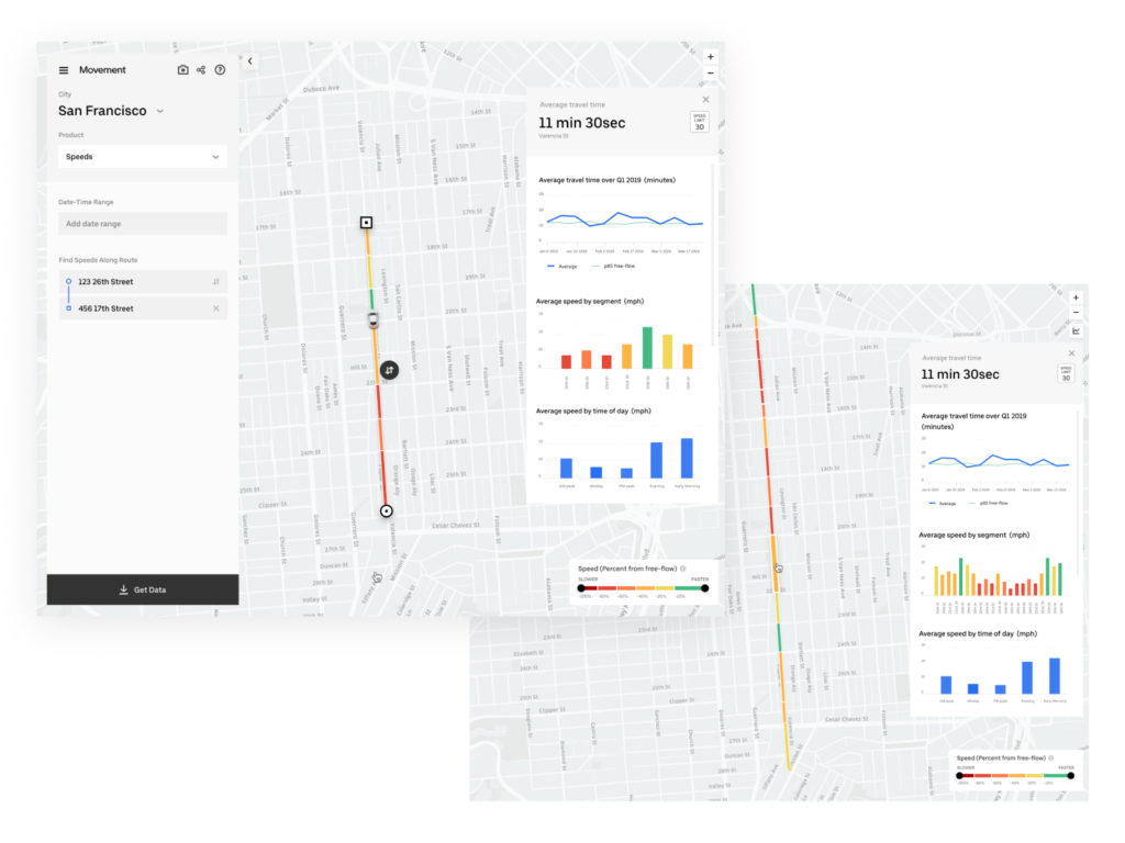
Concepts for corridor analysis
We also experimented with street/corridor analysis, allowing further deep dives into the data. The data panel that pops up on the right (User can toggle this at any time) is a consistent experience we wanted to bring to all of our data tools to allow deep analysis when the time was right. It was important to not take up too much space with UI elements that weren’t needed at the time. Creating a more modular UI allowed for more flexible discoverability of data and analysis.
Our newest addition to the suite is the New Mobility Heatmap, which is a public dataset showing the volume of activity of mobility devices for select cities. The heatmap was very fun to work on because it allowed our team to explore what the experience would be like seeing data played over time. I added a video-editing-esque play bar at the bottom that allows the user to toggle the time range as well as scroll through the time period they’re looking at. Due to data privacy restraints, the user can see only data in broad time buckets, weekdays and weekends. However, once we’re able to gather enough data and anonymize it, we plan on following the time filter pattern I’ve set in the other data products.
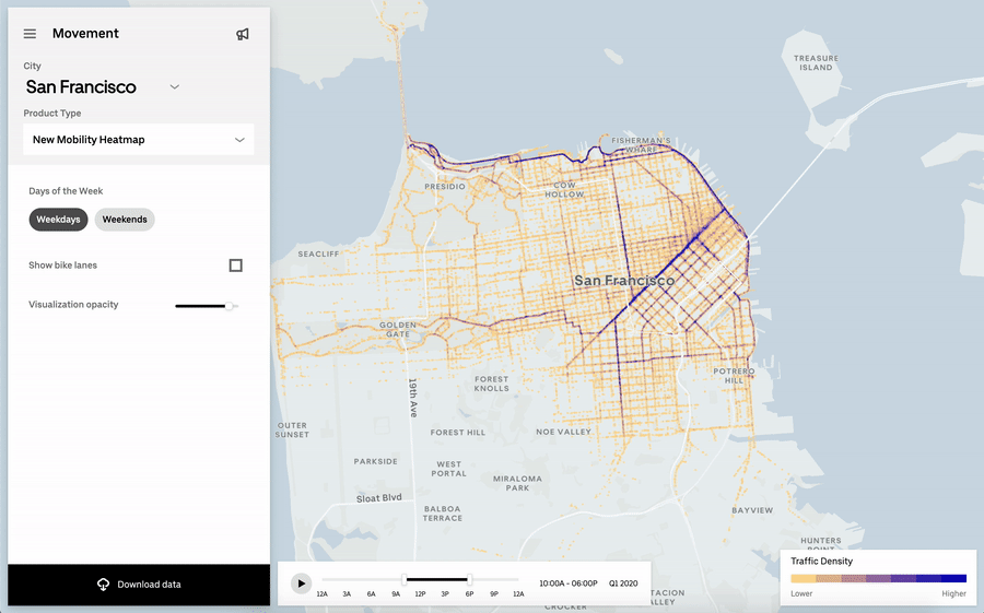
New mobility heatmap
Product entry rehaul
In order to get the best out of our public launch of the speeds dataset, we also wanted to reassess how effective our home page was. The previous home page experience was your typical cookie-cutter landing page with a very un-engaging hero video, a couple of CTA buttons and some basic information below the fold. In collaboration with Charlie Waite, the product entry flow and first-time experience became more focused, engaging, and targeted specific customers. We centered the experience all around cities.
Product parity • Consistent experiences across products
Another big goal of mine was to unify the experiences the user has across the products – because before there was dissonance, inconsistent UI Patterns and interactions, and different features that might cause confusion.
For example, Travel Times allowed the user to download the data after they’ve filtered it, and Speeds didn’t at first. I saw many opportunities like these to create parity where it made sense and to allow for custom functionality where it made sense. My goal was to make sure the user was never frustrated or confused by the UI, which meant creating a mini design system of patterns around map interactivity, data filtering, data analysis, and frictionless switch-ability between cities and products.
Date
December 16, 2019
Category
data vis, interaction, product, research, user experience