Project Iris
The spark
I was approached by Barbara Hollis, the Director of Development and Alumni Relations for the School of Natural Sciences and Mathematics and a colleague of my former supervisor (Roger Malina), about an under-the-radar idea on campus called Project IRIS. We met for lunch one day to discuss the details, and I was so excited I jumped into the project full-force.
Barbara, Tim Barry, and John Hoffman started Project IRIS – a campaign to build a state-of-the-art visualization center on the UTD campus. It would hold the world’s largest six-sided VR cave, a humungous 3D visualization dome, and multiple “igloos” (mini caves) meant for smaller group-work. It would be a remarkable facility supporting STEAM (STEM + art) students, teachers and professionals.
My role: Throughout this project I developed brand identity concepts, met with committee members, discussed iterations and pitched and presented ideas and final deliverables. Although the campaign was concluded due to insufficient funds, in this case study I will unpack my process and thinking.
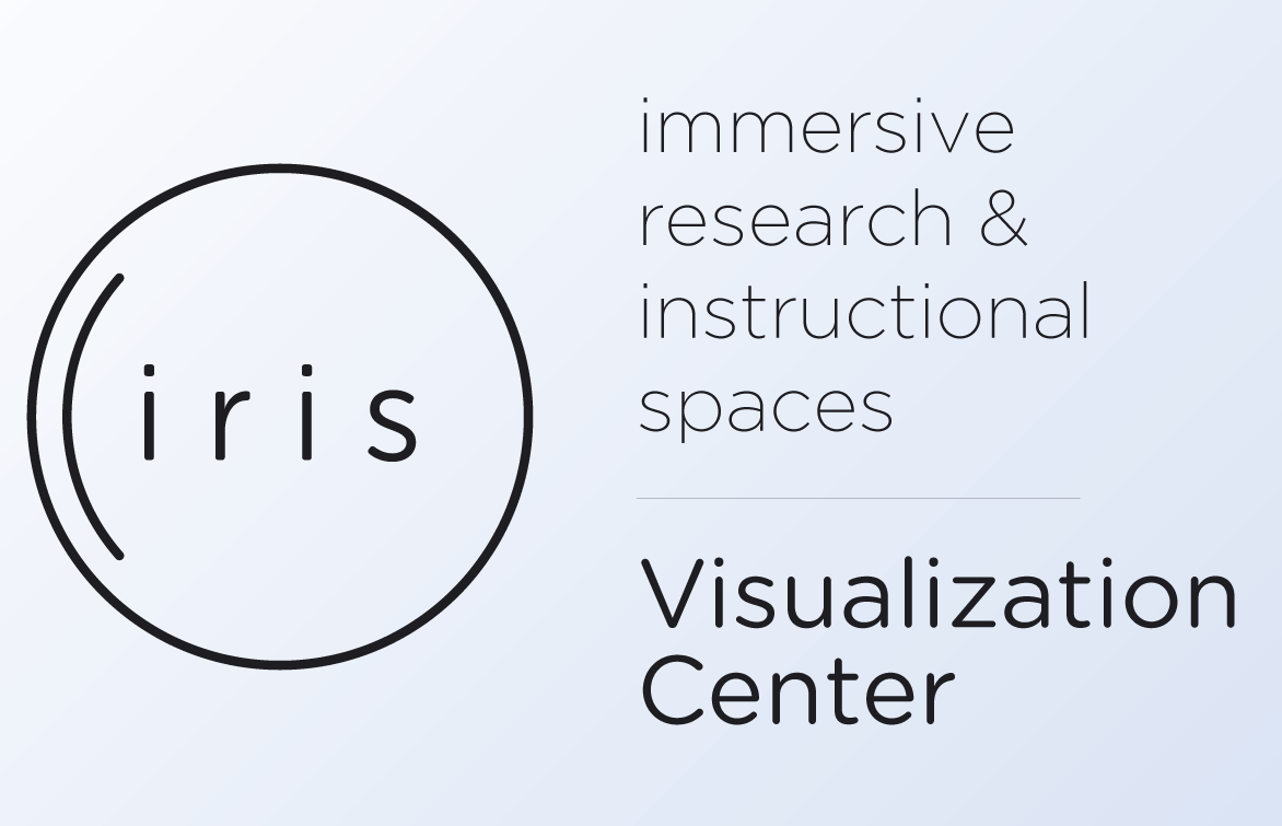
IRIS: Immersive Research + Instructional Spaces
The Project IRIS Mission: To provide a set of large-scale immersive 3D labs for interdisciplinary studies focusing on the sciences, engineering, industry, medicine, and the arts.
Research and competitive landscape analysis
Other state-of-the-art visualization centers in the country include NASA, Virginia Tech, UCLA and UC Boulder. IRIS would be the first in the south. Many times I would here the committee members murmur the phrase “UTD will be the MIT of the south.” Top-tier status became a prominent theme very quickly. IRIS was also projected to cost a whopping $40 million. And this campaign was supposed to generate the right kind of interest so they could pay for it.
Simply put, I had my work cut out for me. This was my first time working on such a huge project, and I was equally nervous and exhilarated.
Most importantly, an interactive, interdisciplinary, collaborative experience was pivotal.
I wanted the IRIS identity to be modern, adaptable, and interactive – which is very germane to its purpose. I also wanted the identity to be simple, yet bold. The interactivity would come later, so initially I focused on lines, framework, structure …the bones. However, I always kept interaction in mind; I played with lines and shapes that could move and transform.
There were some predetermined metaphors I had to follow; IRIS was not accidentally named. The committee members really wanted the incorporation of an eye in the logo mark. The rest was up to me. The main challenge would be to break mental barriers and preconceived notions of how to incorporate an eye without it being obvious or campy.
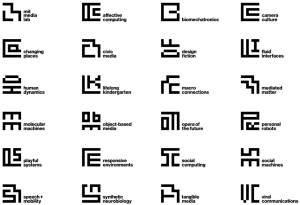
After a lot of research and digging around, I discovered that many VR and visualization centers had poor, if not terrible, branding. Although disappointing, this was not really surprising, as more often than not designers are nowhere to be seen in engineering projects. So, instead of looking at other visualization centers around the world, I decided to derive inspiration from another source: the MIT Media Lab. With its new identity crafted by the design deity, Michael Beirut, and the folks at Pentagram, it couldn’t have been a more appropriate – and challenging – competitor.
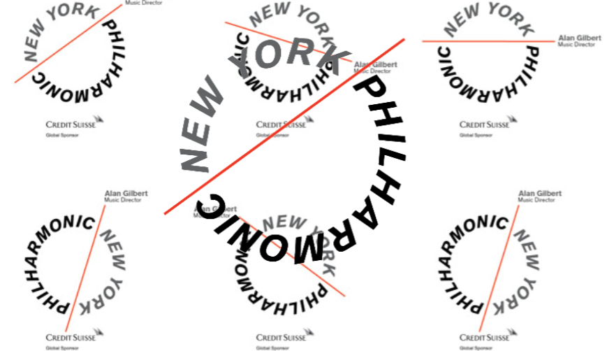
Other inspirations included New York Philharmonic’s new mark and Platform’s design and summit way-finding. You can see I have a bit of a crush on Pentagram.
I wanted to emulate the flexibility present in the Media Lab’s cohesive design. There are multiple marks, but they all seem to fit together. Why is this? Well each mark is created on the same 7×7 grid, contains the same proportions and has the same look and feel. The acronyms are also uniquely positioned as if they are “fingerprints” for each research group. The applications for this kind of design are endless.
What it looks like inside a designer’s brain + #sketchhhhhhing
Having a sketchbook and pen in my hand is like sitting by a fire drinking a hot cup of cocoa on a cold morning. I couldn’t be more comfortable. (Anyone looking for a full-time professional sketcher? lol)
It’s time to flesh out my ideas a bit. Sketching is not only therapeutic for my soul, but also very useful for documenting ideas, rapid iteration, and open-ended conceptual design. After some thoughtful research, it’s time to start getting hand cramps.
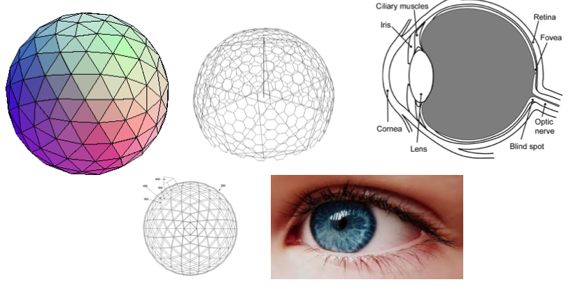
My first impulse is to think about shapes. Circles, to be exact – or spheres. An eyeball is a sphere. A dome is a semi-sphere. Circles have many meanings – unity, all-encompassing, rings, math – they are almost like nature’s shape of choice. Starting with a circle is the next logical step in this design journey. How to use the circle is really the question. With such a simple shape, there are many ways I can alter its meaning.
A visualization dome has a very specific structural accuracy to it. It’s not just a smooth surface like a normal sphere. Geodesic domes are built by connecting other polygons, like triangles or hexagons, and changing the angle at which it is connected slightly. They are also semi-spheres, but not exactly half a sphere. There is a lot of math that goes into building a dome.
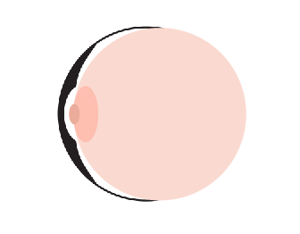
I also looked at the anatomy of an eyeball. An eyeball (as seen on the outside of the face) appears to be a diamond-like shape but is, as you know, a near-perfect sphere. You can also think of it like circles within a circle – or spheres within a sphere. But the eyeball actually has some unique shapes to it – especially from a portrait side view. Anatomically speaking, there are a couple of protruding ovals on one side of an eyeball – the pupil and lens area.
This is a good foundation to start on – but I want to make sure I don’t get too literal. I just need to be inspired.
Phase 1: The Pitch
My first pitch to the committee included four black/white concepts. Every option was created with its potential interactivity in mind. I created sample animations on keynote to give the committee a taste of what I was thinking, accompanied by a story:
Imagine walking into the IRIS facility and the logomark blinks at you as you enter. You think it’s a coincidence at first and keep walking.
Then you notice it following you as you keep walking. It keeps blinking as if it’s waiting for a response. You try waving to it and the mark responds playfully! This interaction fills you with surprise and wonder. You’re smiling and excited for what’s next.
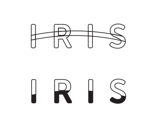
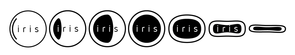
Concept 1
This concept was probably the most flexible with the eye and dome imagery. I wanted an option that didn’t scream “eye” or “dome” so I created a logotype that embraced an arc – and could even be filled up (think of liquid filling the letters like a glass cup) with color. It was modern and understated to me, still with plenty of room for improvements. I also liked the line version, mimicking architectural blueprints. In the end, the committee felt it was a little too far from the original idea.
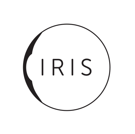
Concept 2
This concept was partly inspired by the story I mentioned before. The shapes are a refined inverse of a cross-section of an eyeball. The circle acts as a visual container for the letters inside as well as establishes a center point to maintain balance for when the circle rotates – “looking around.” The animation I was able to create in keynote made the committee pay attention.
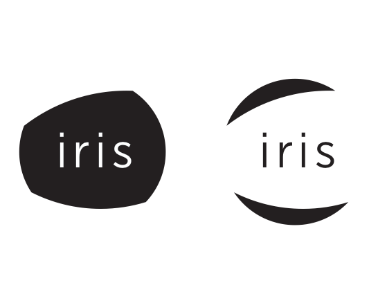
Concept 3
This concept was another part of the story mentioned before. It is meant to mimic the shape of an eye and the eyelids – a more natural, friendly shape. There were two versions – inverses of each other – one being the eyeball and the other being the eyelids. They could easily be interchangeable, which excited me because it was very flexible. I also had the committee imagine this logo “blinking” at you. Each time the shapes would collapse on itself (aka “blinking”), a new word would emerge in the middle where “iris” had originally been. This option felt very playful and fresh to me. This is the only option I used all lowercase type. It was also very simple and bold, just what I was picturing. Additionally, I think the scalability of this option was the best of the four, especially the black inverse version.
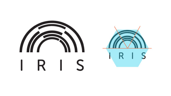
Concept 4
With this concept I focused more on dome imagery combined with a new interpretation. I did some research about domes and how they are built. Architectural blueprints are always a beautiful starting point and the math behind building a dome is detailed and concrete. I chose to add some of the math into the mark. I used 60o angles of a hexagon to decide where the breaking point of the arched rectangles were.
I also added a sense of “identity” to this option (besides the obvious ‘brand identity’ of a logo). Not only will this be an incredible facility for the university, the community, and the many talented students and researchers who would use it, but it would also be a very unique statement of UTD’s values.

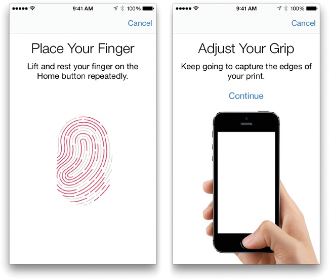
I was inspired one day when I was adding a couple of fingerprints to my iPhone lock; I was tired of not being able to unlock my phone with all of my fingers (you never know which fingers will be free whilst multi-tasking!). The way the fingerprint design is “filled” in more and more each time you press your finger against the little circle… It’s a delightful feedback interaction that tells you if it needs more fingerprint information. This really imprinted on me (*slaps knee*). So, I designed something that felt like a fingerprint for this facility that also reiterated the building shape. In terms of animation and movement, imagine the arched rectangles moving in out of the semicircle clockwise and counterclockwise or elongating and shortening simultaneously. This animation, unfortunately, was (or felt) impossible to do via keynote, so I had to be extra diligent with my words.
The scalability of this concept was the worst of all of the options, I think. At its smallest size, I think I would choose to omit the type.
![]()
![]()
![]()
![]()
So which one did the committee all agree on?
To my surprise, the committee wanted option 2.
Did I agree?
If it were up to me alone, I think I would have moved forward with option 3. I think option 4 is complex and elegant, but maybe not playful enough. Option 2 is maybe just a little too literal, and option 1 is the most subtle. I like them all, obviously, because I created them :). But every creator has her favorites, I suppose.
The next meeting I had variations and applications of option 2 for each committee member, ready to hash out details, ideas, and alterations.
But something else happened.
Thanks to a new visiting member (and fresh eyes), there was an observation made that is probably a nightmare for every designer. But in retrospect, I’m very grateful for that moment.
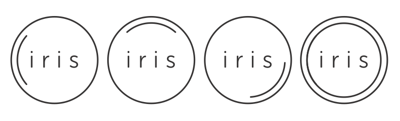
Let’s look at option 2 again. Does it remind you of anything? Take a second. Don’t worry, I’ll wait.
Do you see it? I really want to know if you see it. Think.
A boob.
Ahhhh now you see it!! But before you didn’t, did you? Well, you can’t un-see it now. It’s there. It’s totally a boob. I mean, it’s an eye, too, but there have to be other people, like this lady, and me now (thanks, lady!), that see a boob and a nipple. Damnit.
Back to the drawing board.
After this observation was made, we all seriously considered dropping it altogether. However, the members still liked this option and instead suggested I change it a little so it looked less like a boob. Ok. I got this.
Although extremely embarrassing and humbling, this was actually a blessing in disguise. The new iterations that came from this debacle were, in my now impure eyes, much better… Plus now I have a good design story to tell.
Back to the drawing board
After some tinkering and many cups of coffee, I came up with a simpler, more line-centric, iteration. I arrived here after frustration with the shapes and negative space I created with the original mark. Without changing the shapes entirely, I couldn’t seem to get rid of the “the boob.”
This is one altered version I created before coming up with the final iteration. I wanted to show the 3D potential, and tried playing off the blinking interaction by making a small storyboard.
The final iteration is a lot better. Comparing the two versions side by side, there’s no contest. I would choose the newer iteration every time. And it’s all thanks to boobs. ![]()
What I changed: First, and most obviously, I changed the eye lens shape (aka nipple) into a simple curved line. This line achieves the same idea with less. Less is always more. I also made the line thickness the same throughout (including the type), which really changes the whole feel of the logo. Before, there were too many inconsistencies (line weight, sharp vs. round, etc.) of the logo and it made it feel dated, amateur, and incohesive.
The type was changed too. I decided I wanted to maintain a rounded look, so I used Museo Sans Rounded with a weight of 300. I felt the non-rounded type was too sharp. I also made sure the curved line could rotate 360 degrees perfectly inside the larger circle in preparation for animation.
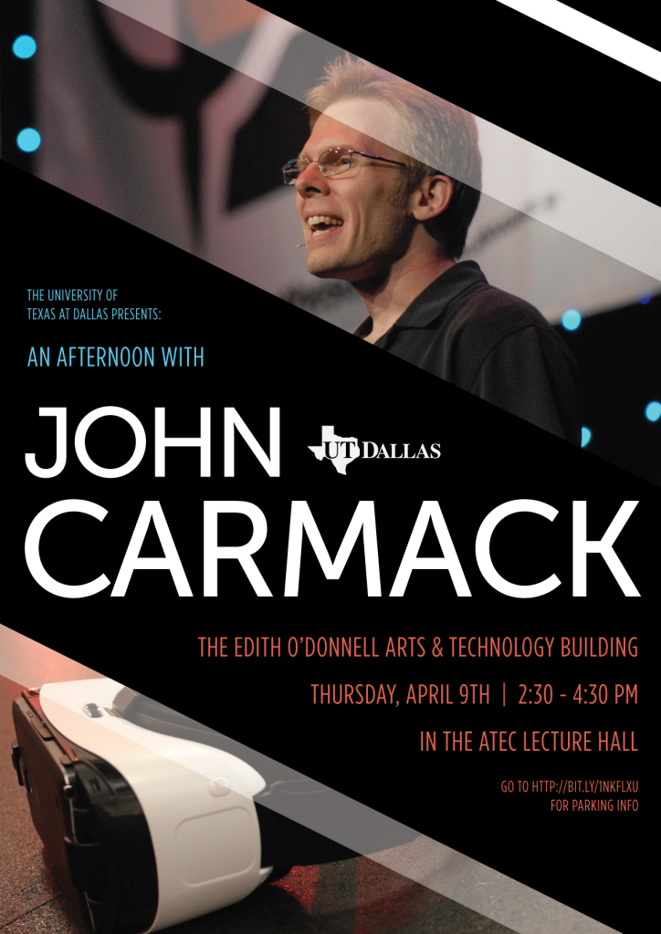
John Carmack comes to UTD
Towards the end of the semester, an ArtSciLab colleague had been in contact with John Carmack, founder of Oculus VR and all-around gaming legend, and convinced him to come have an open lecture at UTD for the ATEC department. As exciting as this already was, the Project IRIS Committee also felt it was a serendipitous chance to pitch Project IRIS to him. (I got to meet him!)
As a part of this, I created this poster to draw attention to the event.
Learning new skills
To take the branding to the next level, I wanted to create an animation in after effects that showed the potential for interactivity. However, this was an obstacle. I had never seriously used Adobe After Effects before. I had used it once for another project that had nothing to do with animation – so I was basically starting from zero.
But, it’s never too late to learn a new tool or skill. 🙂 As long as you keep animation principles in mind and sketch/storyboard first, you should be able to navigate a new tool.
This was my first attempt at animating the mark. Looking at it now, I cringe a little, although I’m still proud of what I accomplished for my first try.
Iteration is Queen
This is a heavily revised attempt. It’s a much better rendition, but still with plenty of room for improvement and creative expansion. I learned a lot about Adobe After Effects because of this project, and I’m very grateful for the motivation it gave me.
Unfortunately, this is where the project ends for me. I graduated UTD very soon after I gave them the revised animation, and the committee was satisfied with the design package I gave them (even if I wasn’t).
Soon, the entire project was concluded due to a funding shortage.
Noob Insights
Pitching ideas to an entire committee and adhering to the group’s opinion was a first for me. It was equally nerve-wracking and thrilling presenting my designs to a group of professors, industry members, and organization leaders as a mere senior undergrad. I learned that you must conduct yourself differently when pitching your ideas in the “meeting room with the big table” than in your “boss’ office.” These places are entirely different zones. The “boss’ office” is for brainstorming, questions, note-taking, and discussion. The “meeting room with the big table” is for confident presentations, open Q&A, problem-solving, and over-preparedness (the last one is arguably applicable all the time).
These observations might sound childish, or obvious, but as a young female aiming to be a respected professional, the politics and rules of office culture become very clear after you experience them. I already had plenty of “boss’ office” experiences in internships and university work, so this project was precious to me.
If I could go back and do it again, I would have involved other students or designers that knew more about 3D software to help me render a 3D visualization of the logo mark. That would have taken this project to the next level. I could have always learned the software myself, but there just wasn’t enough time. Considering the project concluded shortly after I graduated, it might have seemed fruitless, but the new skills and tools acquired would have remained.
Date
January 13, 2015
Category
identity, interaction, motion / animation, research