Uber | Moving What Matters during COVID-19
#MovingWhatMatters
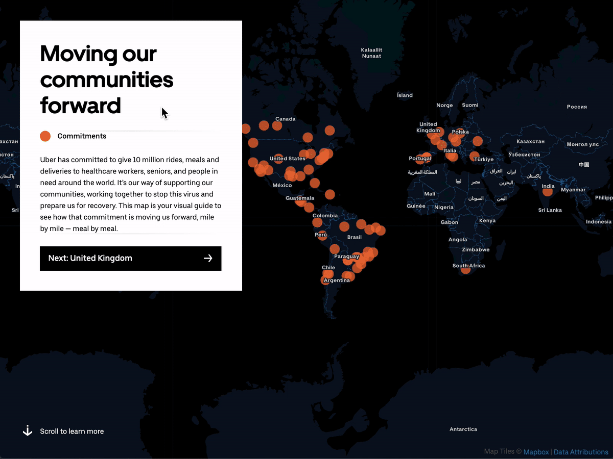
Earlier in April, Uber committed to giving 10 million rides, meals and deliveries to healthcare workers, seniors, and people in need around the world. I was lucky enough to jump on the opportunity to help visualize all of our efforts with a small, agile team. I want to take a moment and mention the other members of our team for their incredible efforts in such a small window of time. Xintong Xia, Jon Sadka, and Andrew Duberstein are the talented engineers who worked nights and weekends, Surachita Bose is our marketing mastermind, Travis Gorkin is our engineering manager who helped keep us organized and honest, and Eugenie Teasley, manager for the social impact team and spearhead behind the pledge, helped wrangle all of the data together into something palatable. There were many, many more people who helped make this happen, but these were my key collaborators.
Timeline, scope, tech contraints
We had about 2-3 weeks to launch the first phase of stories on the live website for a community recovery press release. There were about a dozen different efforts happening at the time we started – there’s probably triple that, now – so we needed to quickly determine which stories to highlight. We also had to determine how to integrate the map visualization into our chameleon website, which is our in-house CMS. Chameleon is pretty rigid when it comes to customization, so we ended up settling on an i-frame environment, which gave us complete freedom in the design.
The data & the story
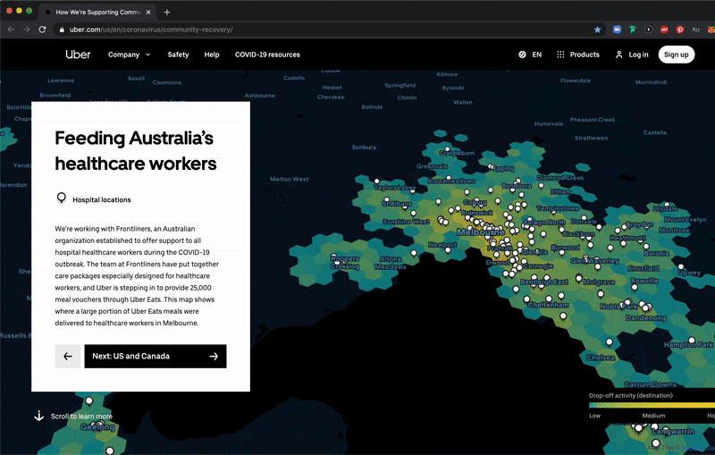
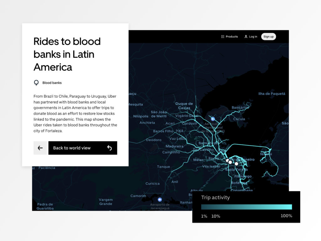
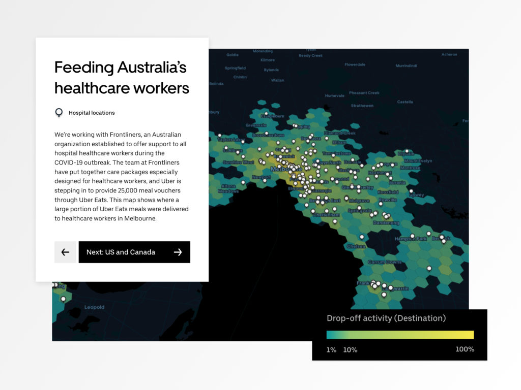
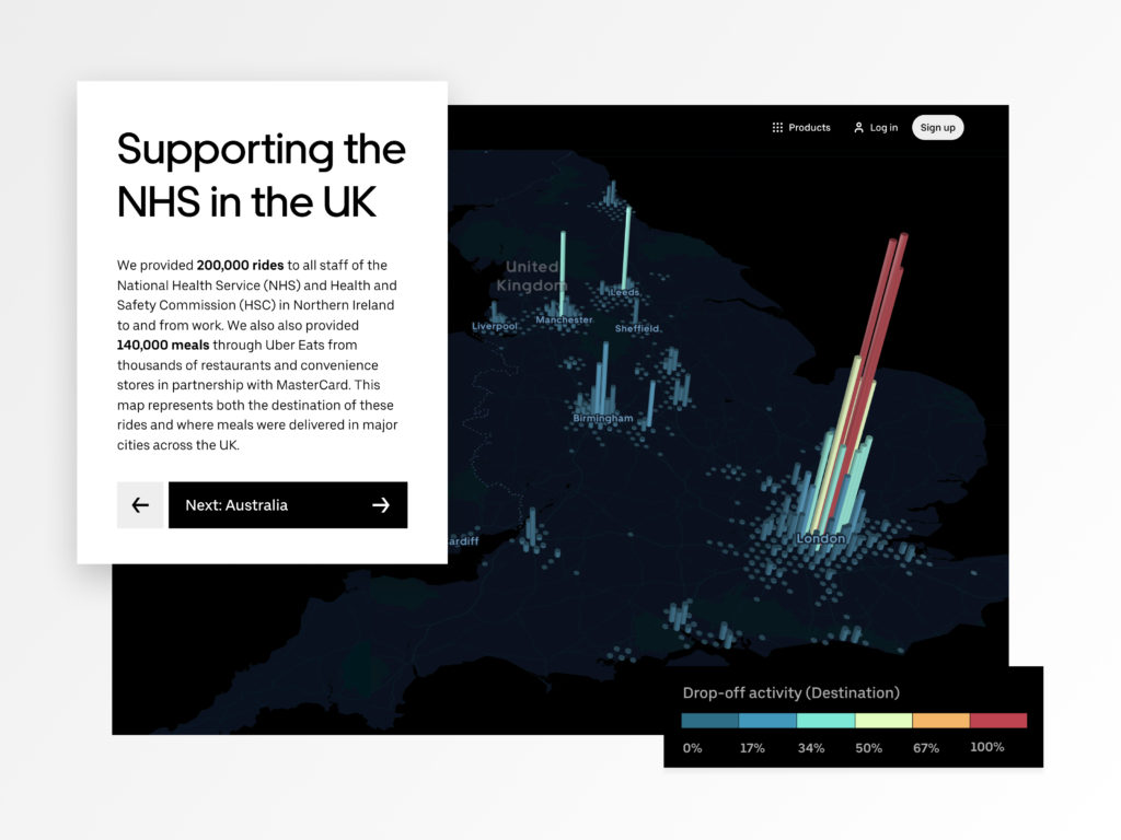
With millions of rows and columns of data, it was my job to come up with a strategy on how to present this data in a way that told the right story to the public. Where are we helping? Who are we helping? What are we doing to help? The data varied in size, locations, and scope, some efforts having more conclusive data than others. We decided to start with the UK because our team had lots of rich data around promo code utilization.
With the UK, We provided 200k rides to all staff of the National Health Service (NHS) and Health and Safety Commission (HSC) in Northern Ireland to and from work. We also also provided 140k meals through Uber Eats from thousands of restaurants and convenience stores in partnership with MasterCard. It’s a lot to take in. To make it more digestible, I decided to focus on the highest activity point, London, while still allowing the view to see the entire UK.
Once our first story was ironed out a bit and we had a few more cities in the queue, I stepped back and thought about the ideal way to showcase our efforts. Did we want to take the viewer on a linear storyline? Maybe a non-linear experience?
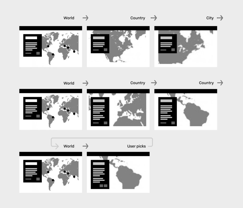
Since we had unequal coverage and incomplete data across all of the regions and cities, I decided a linear experience was the best MVP so we could guide the viewer through the different stories and visualizations. Once we have more complete data I’ll feel more confident about a non-linear experience. Because of the guided experience, we wanted to limit noise that took focus away from the visualization and accompanying text. We prevented the viewer from being able to zoom because this would interfere with the scrollability of the page while they’re in the iframe. We hand-picked the zoom level and pitch for the most optimal view of each visualization. I hand crafted the visualizations and color palettes for each story. We also made sure to keep consistencies in place for user-friendliness – legends & keys, transition animations etc. See more below: