Designing VoiceOver experiences at Uber
Uber’s POV on accessibility
Over the last couple of years, Uber has shown the world that we care about accessibility. When you’re a global company, it’s not only good for people but it’s good for business.
In the past, however, it’s been somewhat of an afterthought. Employees care about it, but it’s a nice-to-have (not a need-to-have) for shipping a product. You’ll find accessibility champions and independent efforts here and there across the company, but never a strong, coordinated initiative. Many folks, including the Design systems team and the platform team, are trying to change that.
In April (2020) a first-of-it’s-kind giant government contract RFP had WCAG compliance as a line item, which gave our business reason enough to get us organized and mobilized. This was the catalytic mechanism we needed to execute.
Because the right thing to do is to provide an excellent experience for all of our users, including people who are blind or low vision
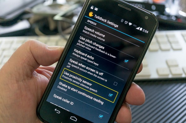
What is VoiceOver & TalkBack and how does it work?
VoiceOver is a gesture-based screen reader that lets you enjoy using an iPhone even if you can’t see the screen. This accessibility feature gives equal opportunity to people that have low vision or are blind who can enjoy modern apps and technology that other non-vision-impaired users have easy access to.
Like myself, I imagine many people have never experienced this feature or didn’t even know it existed. After a quick search, you’ll find Apple’s official User guide to be deceivingly simple, leaving a lot to be discovered later by trial-and-error. The video tutorial above is a good starting point, if you’d like to try it. If it’s your first time, you will definitely experience frustration and, hopefully, empathy. If you’re not visually impaired, I challenge you to use your phone with screen curtain on and VoiceOver only. I guarantee it will be a whole new world.
Thankfully, some people who are blind or low vision don’t mind sharing their Uber experiences publicly. You can watch Cayla or Joy talk about their experiences ordering a ride on youtube.
TalkBack is Google’s version of this. The frustrating thing here is that both of these products differ so much. They use different taxonomy, are coded differently, and use different sets of gestures (VO gestures vs TB gestures). I believe accessibility features should be universal and brand-agnostic, but at the same time this competition results in better products – it’s a tricky balance.
Key pain points in Uber’s rider app
Uber has unique challenges when it comes to low vision and blind riders. As a rider, how do you successfully navigate to a Pool Express pick-up point in 5 minutes? Most BVI users feel cornered into using only Uber X and above because the driver guaranteed to come to you, however this means they have unequal access to less expensive options.
And once your driver arrives to your location, how do you manage to get in the right car? According to our research, most users end up calling the driver and describing themselves, relying more heavily on their driver to find them, or ask a random stranger around them to look for the car described in the app. This experience is less than ideal for many reasons. Hit the button below for more on how I navigated these issues.
See design case study
Understanding Apple’s VoiceOver Guidelines
If you take a few minutes to reach out to BVI folks or ask in a forum, they generally say they prefer Apple’s suite of accessibility offerings. Why? I have my own theories, but here are some key differentiators that make Apple stand out:
- They celebrate accessibility. They don’t treat accessibility like a business obligation. “Technology is most powerful when it empowers everyone”
- They understand BVI users. Their products are soaked in rich stories and data.
- Accessibility is weaved throughout their product ecosystem. It’s never an afterthought. Accessibility is a priority and is designed to scale.
Apple’s guidelines feel thorough and absolute. However, the more you work on accessibility within your own product’s industry, surface, or environment, the more wiggle room you’ll see in between the lines. My partner (our very own accessibility champion on the Design Systems team, Corin Nader) and I found ourselves questioning Apple’s guidelines the longer we obeyed them. We found they often break their own rules. And maybe this is okay. I think it’s a part of the technology evolving.
For example, Apple advises you to keep voiced hints clear, short, and concise. You shouldn’t put repetitive information or known gesture explanations into hints (unless it’s unique) because it’s a waste of users’ time. Funnily enough, you can find native iOS apps that do the very thing Apple advises against, like button element hints explaining a well-known gesture, “Double tap to activate.” I think the lesson learned here is that these guidelines are just that – Guidelines. They are there to showcase best practices, examples, and learnings so you can design better experiences for people who are vision-impaired. They are not absolute or inflexible.
Apple’s philosophy puts great emphasis on respect for the user’s time. This makes total sense and I love the overarching principle. After all, it’s just vision the user may or may not have, not brain cells! You might be shocked to hear BVI users listening to VO at three times the pace you would normally listen to someone speaking. It’s pretty awesome. This makes consuming information as equally efficient as reading with your eyesight.
My next adventure in the VoiceOver world is to see how different the desktop experience is from mobile and what other challenges this might present for our desktop products. Until then ✌️