Merlin Health™ | iOS + Desktop apps
“The dysfunction of our modern health care system isn’t about failure of intention, but rather pursuit of siloed and sometimes conflicting priorities. The needs of clinicians haven’t always aligned with the needs of patients, and both are subject to the demands of payers and regulators, and the financial limitations and business strategy of the provider organization. When each party manipulates and adapts to meet its own needs without regard to the needs of the others, it creates the incoherent mess we call our healthcare ‘system.’”
–Stacey Chang, MS, NEJM Catalyst
In a rush? Jump to the section you want to see:
UX Activities and Deliverables
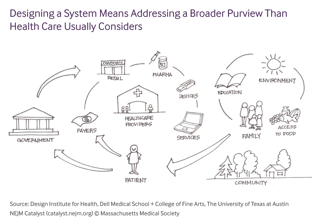
A complex problem space
How do you innovate in a space that is built on conflicting priorities and non-transparency?
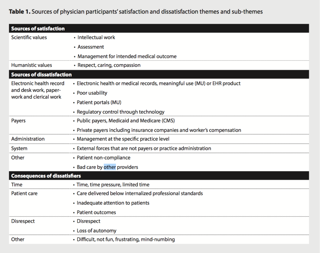
It’s no mystery that our healthcare system is broken. Whether it’s the costs of healthcare skyrocketing or if it’s the millions of doctors that have lost authority and autonomy as they have been pushed into the middle class, once you start digging and asking questions, you can clearly see all of the load bearing components that have become decayed. But it’s not just costs and doctor burnout. It goes way, way deeper than that. Doctors are becoming more and more dissatisfied with the work they are doing due to increased paperwork, poorly designed software, inefficient workflows and less time with patients and scientific research; patients are losing respect for physicians and health institutions while being hindered by paperwork, less access to quality care, incomprehensible medical bills, and lack of control over their health data. There are many factors at play here. Health insurance, EMR/EHR software, pharma, reimbursement models, and doctor and hospital incentives are all issues that many agree need to be reimagined completely.
Source: American Medical Association (AMA)
If you need a more tl;dr version of the research, I would highly recommend listening to Freakonomic’s 3-part podcast series called “Bad Medicine.” Stephen Dubner touches on a few of the issues I mentioned in addition to the pharmaceutical industry and medical research and innovation.
Listen to these podcasts for more info on the medical industry:
Bad Medicine, Part 1: The Story of 98.6
Bad Medicine, Part 2: (Drug) Trials and Tribulations
Bad Medicine, Part 3: Death by Diagnosis
My job for the past 1.5+ years has been to work with an amazing team to reimagine the healthcare experience for both patients and doctors in a mobile-first product. Only once we understood the landscape and pain points, we knew we could build a product that disrupts the current system and provides clarity and ease to those who most need it.
Field User Research and Ethnography
One major obstacle: There were no doctors on our team. We understood the patient perspective but needed to do a little more digging on the doctor perspective. On-site ethnography became a critical component to our research. We visited many clinics, shadowed doctors, attended in-person interviews and Skype phone calls (because doctors’ schedules are packed and unforgiving), as well as brought on a few doctor advisors.
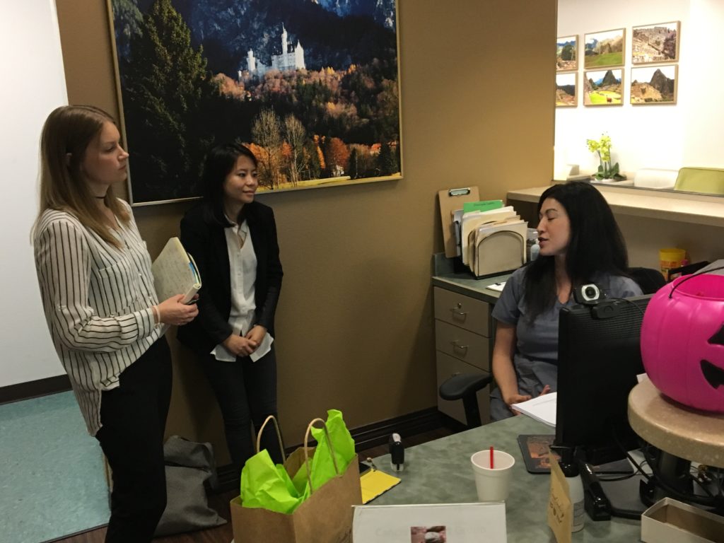
Tiffany Ho (middle) and I (left) interviewing a front office secretary at a local clinic
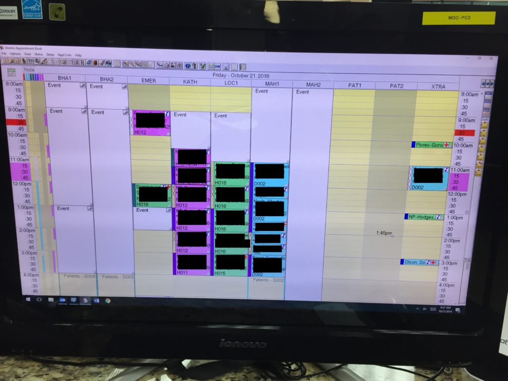
This is what clinic scheduling software looks like (0_0)
From the interviews, we extracted work activity notes in preparation for our WAADs. The affinity diagrams enabled our team to extract and focus on specific pain points that in turn inform our product requirements and features. We did most of the affinity diagrams together as a whole team; while this might seem like a bad idea to some – and of course, it made the activity more difficult – it’s a worthy feat. By bringing in multiple perspectives (stakeholders, CEOs, designers, UX researchers, and managers) early on, the team as a whole felt more involved and invested in the product. This not only boosts team morale, but ensures that the product is being built with transparency about expectations from each part of the team.
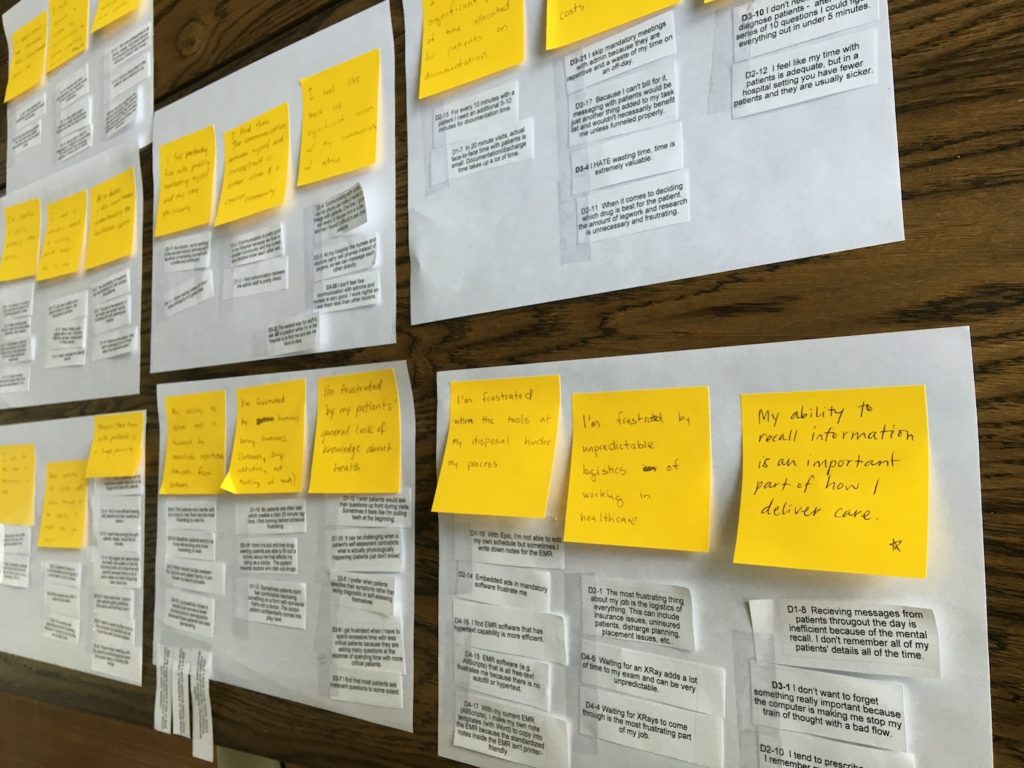
The findings from the research and interviews were quite shocking
Patients now have such low standards for quality of care, and doctors are so jaded that they’ve adjusted to being mistreated by the system.
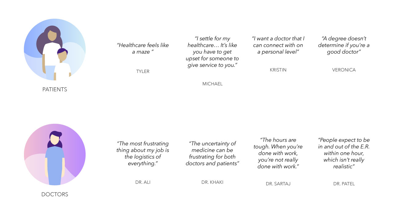
We all knew the healthcare system was convoluted and flawed, but I would never have guessed how unhappy people were with their healthcare. The biggest pain-points for the two sides became quite clear:
Patients
- Have zero control over their health data
- Want better access to care, especially rural
- Need transparency about cost and processes
- Hate feeling like “just another patient chart”
Doctors
- Need more time with patients, less time with paperwork and other tasks
- Want autonomy and flexibility in work hours
- Have lost respect from their patients, generally
- Are incentivized by immediate task completion rather than quality of care over a period of time
- Are just as clueless about insurance and healthcare costs as patients
Product scope
After the research phase, we started to define and refine our product scope. Believe it or not, this might have been the hardest part. Our team wants to solve all of the problems in healthcare :), so it was difficult choosing a set list of features and functionalities for the first product release.
After we went back and forth with the investor, the board of advisors, our internal team, and the founders’ visions of the product, I decided to have our whole team do an activity. I designed a simple spectrum that measured the difficulty of execution of the feature/functionality vs. the importance of that feature. This spectrum was too simple actually (I didn’t specify whether this spectrum was from a development perspective or a design perspective, and I didn’t really define what “difficult to execute” meant – is difficulty measured by man hours or by uncertainties?), but it was very effective in getting the team to see the product more clearly and having everyone on the same page. Before, the designers and developers were being told by various sources what the product was, and now we had all had voted and agreed upon what the product actually would be.
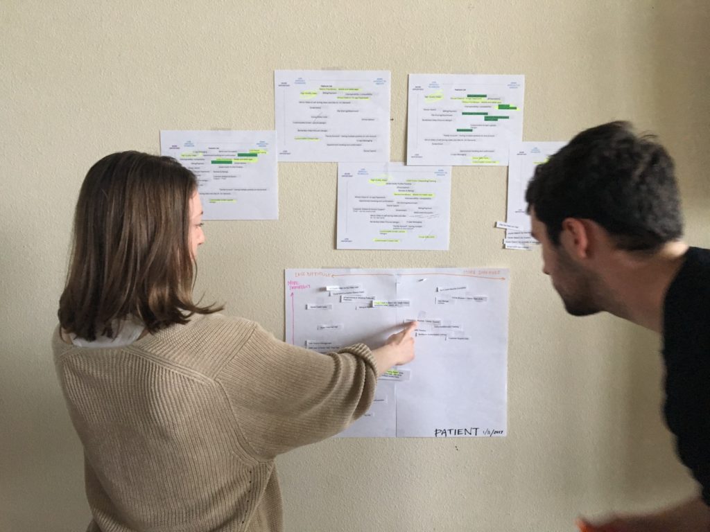
Camilla Hermann, former CEO and Robert Alvarez, Creative Director, working on the scope activity with the team
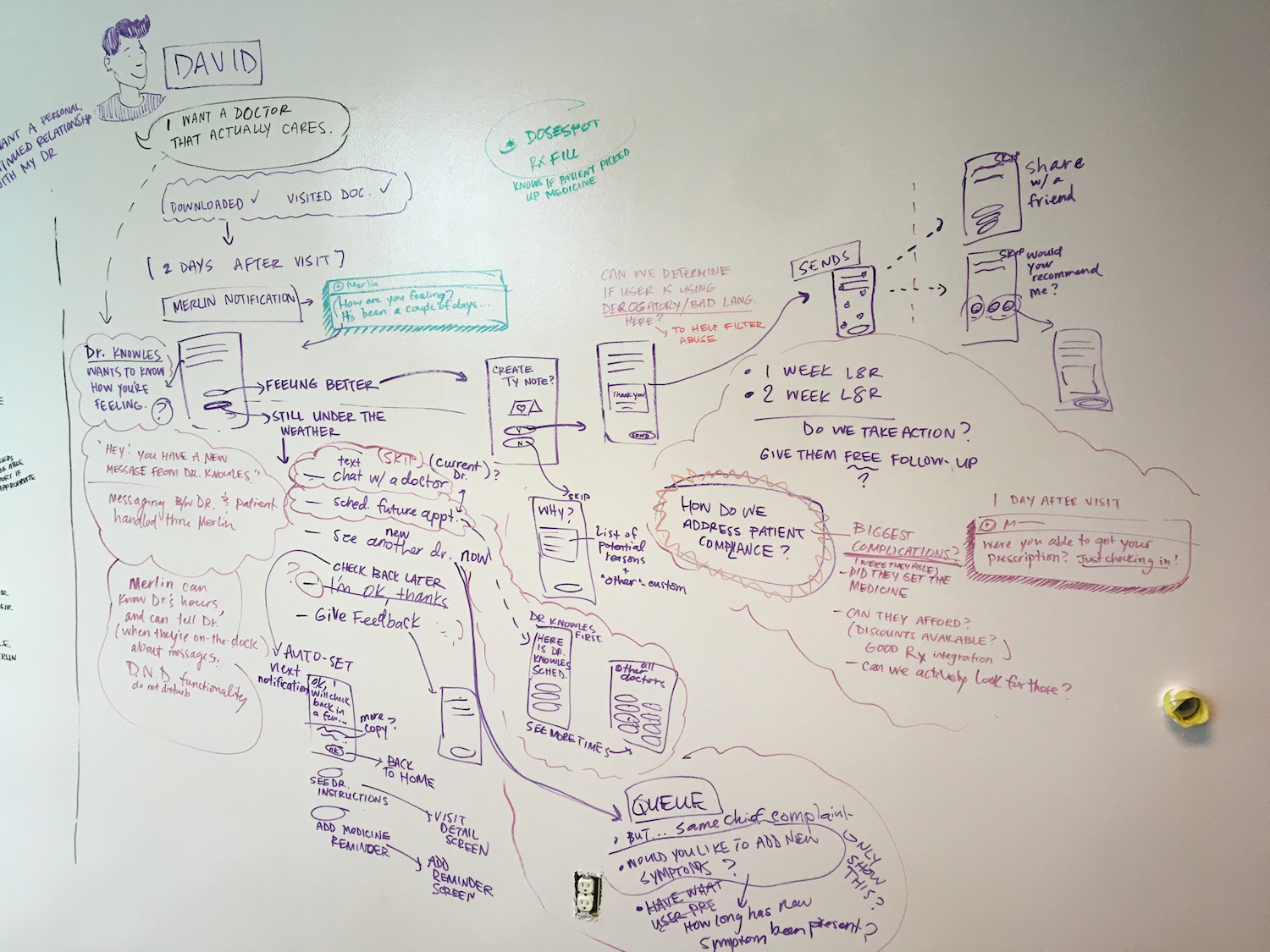
User Journey for “David”
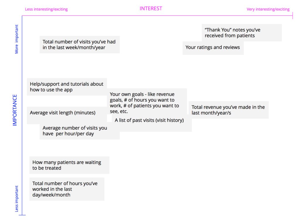
UX Activity – Doctor user drags and drops the feature ideas on the spectrum where he/she sees fit
The Brand Promise
Merlin puts clarity, humanity, and intelligence into healthcare experiences for doctors and patients in an era of doctor-burnout and confusing processes.
Developing the Merlin brand was one of my favorite parts. Our team’s creative director, Robert F. Alvarez crafted a workshop activity to help our team brainstorm, spitball, and pitch different brand concepts after a couple of weeks of research and development. We used classic archetypes as a springboard to develop our brand, which is explained beautifully in The Hero and the Outlaw, a book by Margaret Mark.
The Merlin brand concept I went with was based on the archetype, The Magician, which symbolizes making dreams come true by having knowledge of the fundamental laws of how the world or universe works. This reminds me of magical things we see, like fine wristwatches, luxury cars, or innovative payment systems, that seem simple on the outside but are quite complex when you look under the hood. Reimagining healthcare to be magical, simple and human was the goal in this brand direction. Below you can see the evolution of the mark and some early renditions of the logomark based on the fibonacci sequence, because the magic is in the details. 😉
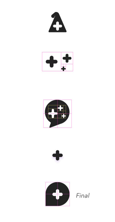
The medical cross doubles as a cue to medicine as well as the magic sparkle. The chat bubble shape signifies our conversational UI, as we want to keep Merlin as human as possible in order to make the experience less clinical and robotic. Telemedicine and telehealth is also about conveniently communicating with your providers and patients, so without all of the logistics, traffic, and external factors accompanied with a normal doctor’s visit, simplicity and quality care come to the forefront.
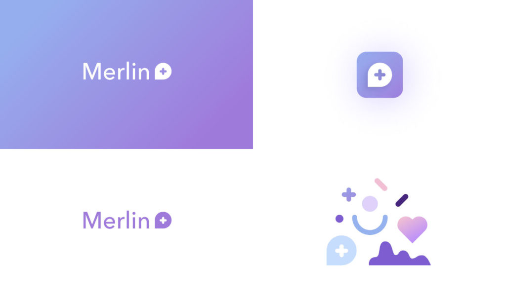
The color palette was another area for innovation in my mind. Most medical brands stay in the blue spectrum, which I think is quite boring. The medical blue, to me, represented the old, broken healthcare standard and systems. In with the refreshing, modern palette! We also wanted to establish a visual system – something that feels fresh and magical, but is also simple and flexible enough to communicate various ideas for marketing and product UI. And to top it off, this palette happened to be the color of the year (2018), according to Pantone :).
Product MVP Execution
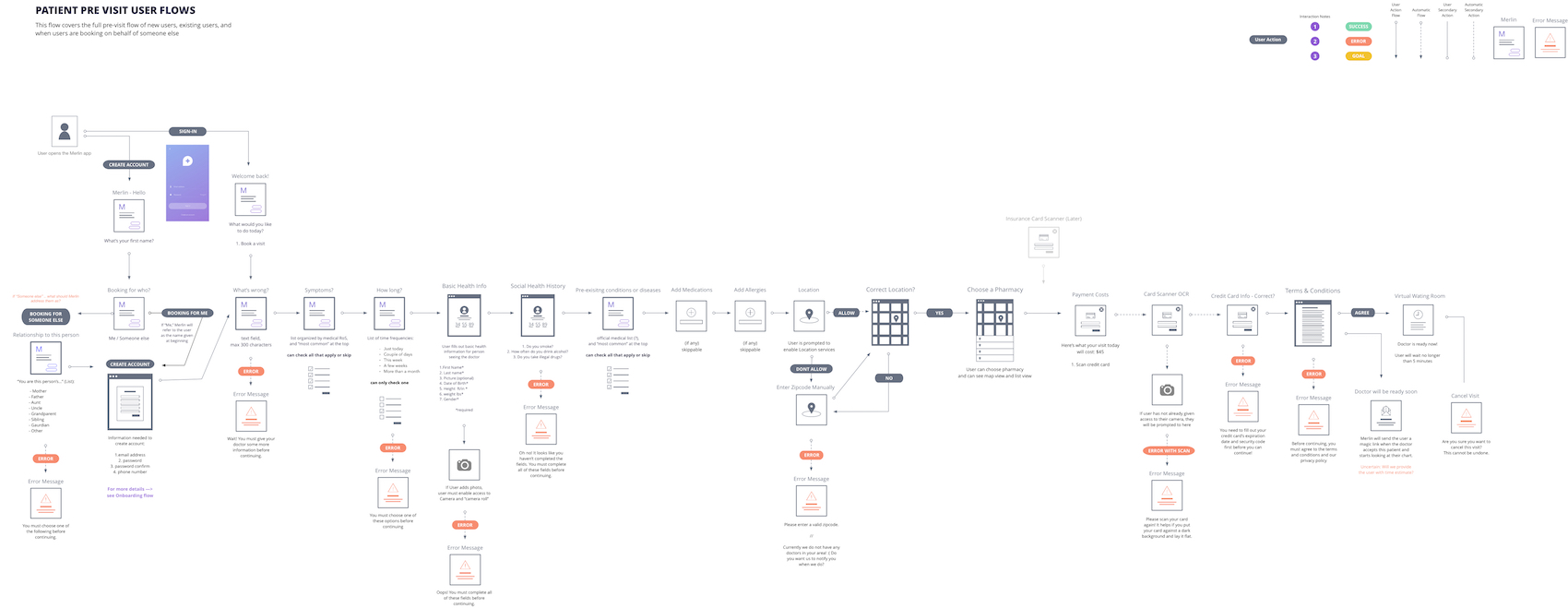
Initial UX flow for first-time patient user
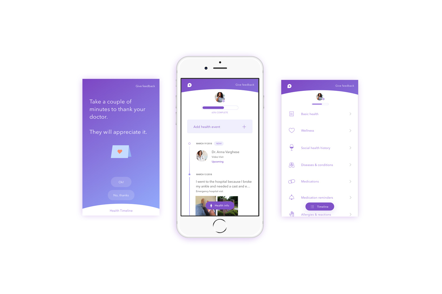
Patient iOS app
There are two points of access to the Merlin product – one for patients and one for doctors. The patient app serves as a bridge between patients and their doctors via telemedicine and an extensive digital patient record that the patient owns.
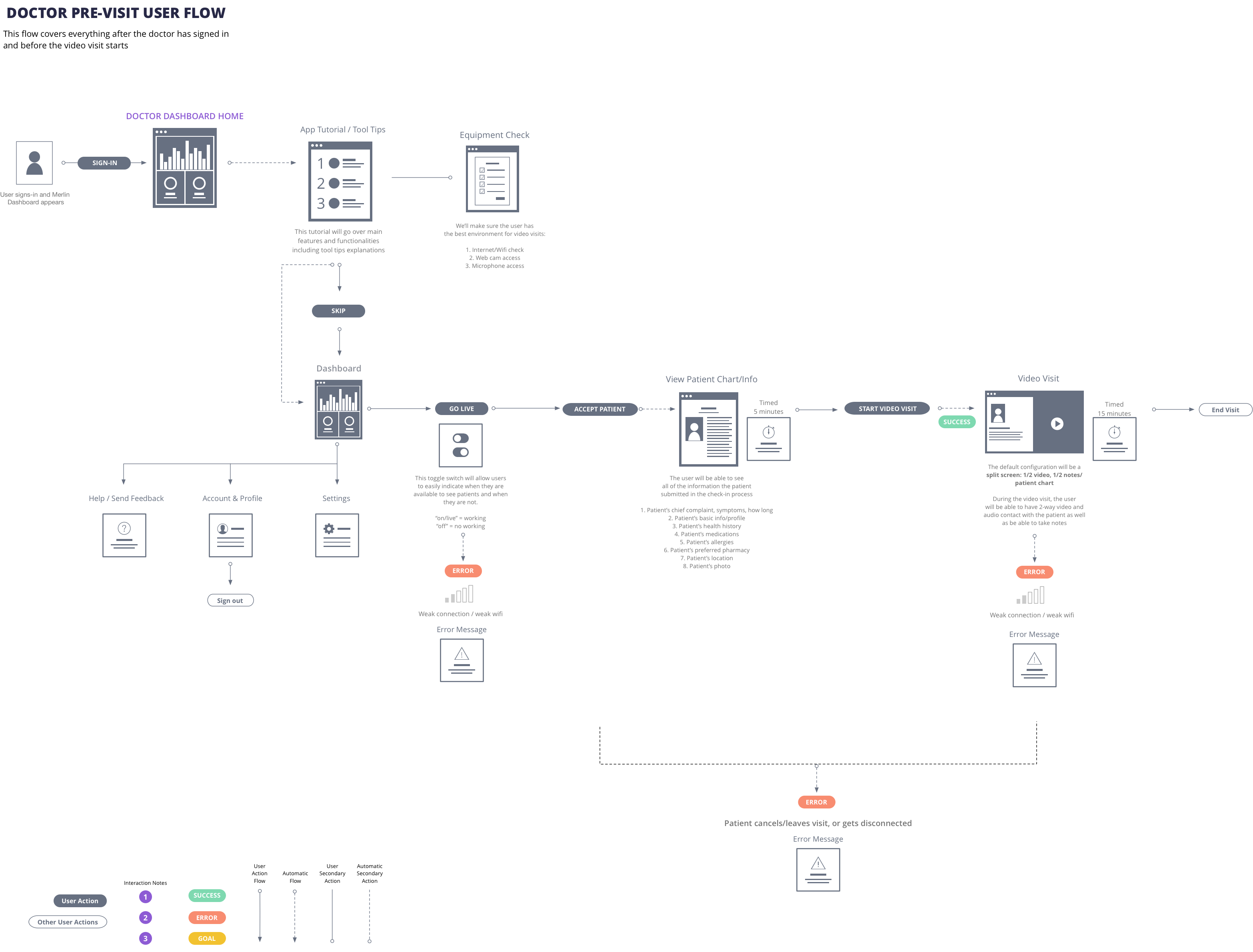
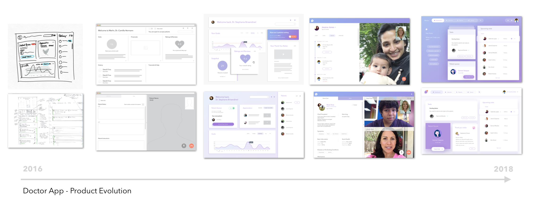
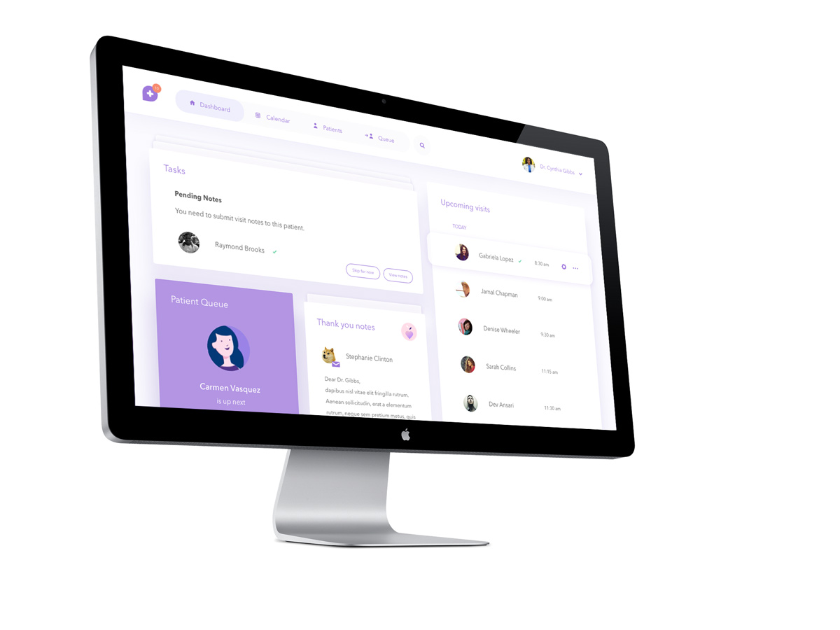
Desktop browser – The “doctor dashboard”
The dashboard serves as an access point for doctors to connect with their patients and keep track of their professional goals. Doctors can schedule appointments, request appointments, see a queue of patients via scheduled appointments or on demand patients, as well as keep track of daily tasks. The best part? Patients can now send their doctors personalized thank you notes. <3
Crafting Merlin 2.0: Thinking about the future
After the Merlin MVP was deployed, it became obvious to everybody on the team that our app was lacking excitement, innovation, and sexiness. We were so focused on execution for so long, that we neglected the big picture of our experience. We went back to the drawing board and re-re-imagined the Merlin experience starting from a few cornerstone ideas:
- Wellness goals and incentive: Patients can add wellness “tracks” or goals to their profile
- Better relationships: In addition to video visits, patients can chat with their doctors via HIPAA-complient messaging
- Exciting health data: Patients can interact with more engaging data about their health, including data from connected devices
- Personalized content: Based on the patient’s behavior, data and usage, Merlin can determine what content is best fit for the user
- Eye-catching UI: Creating beautiful UI by expanding the visual style to include bolder colors and photos
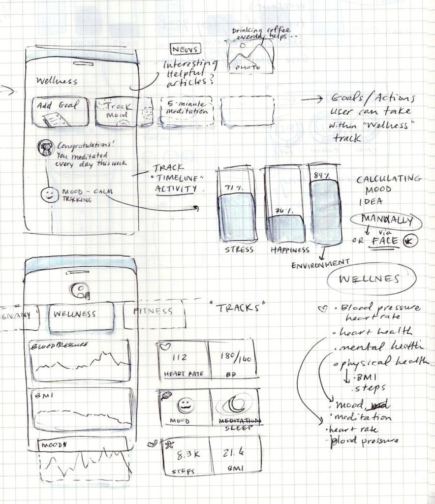
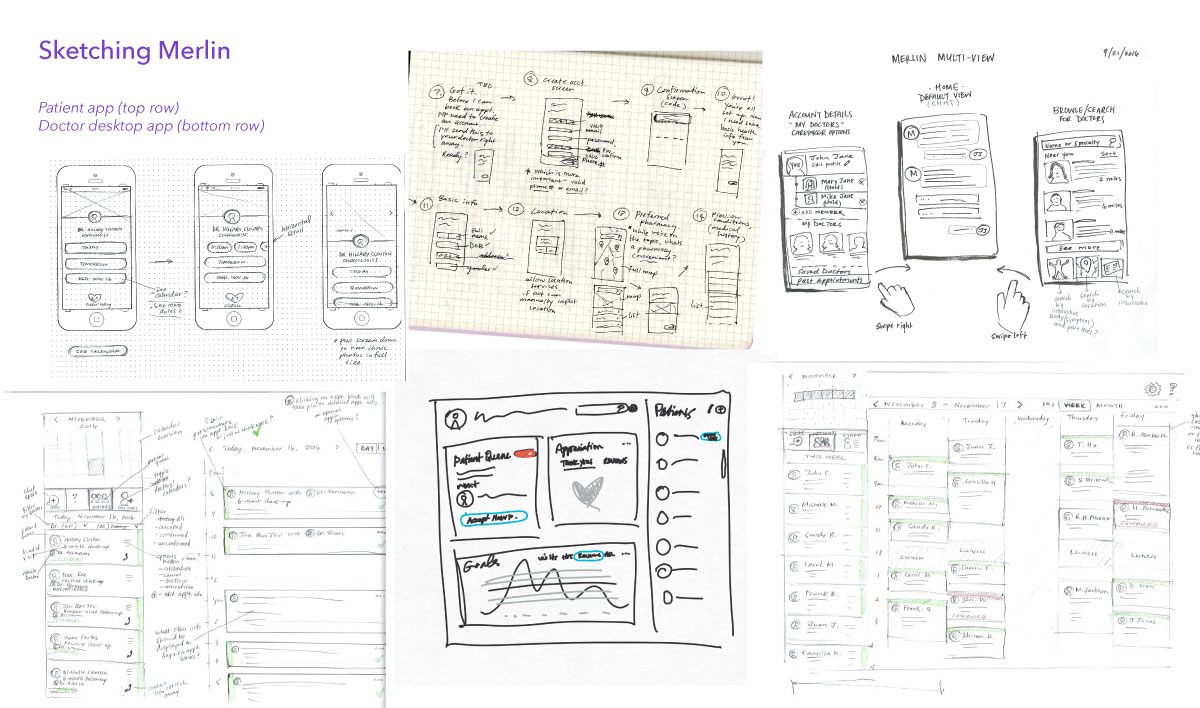
Preliminary sketches – UI and navigation
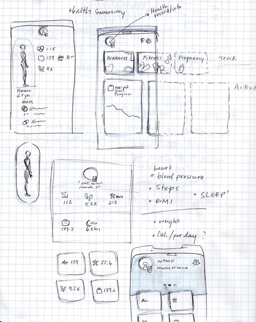
Preliminary sketches – UI and navigation
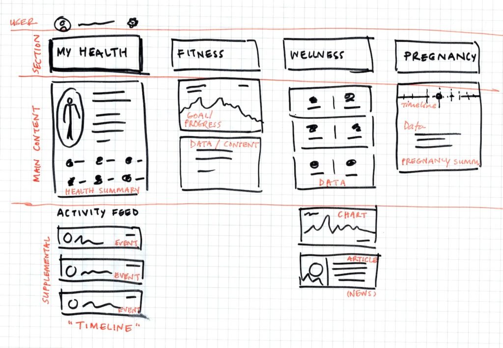
Preliminary sketches – Architecture and navigation
After our design team pumped out preliminary sketches (only my sketches are shown above), we started iterating in Sketch for medium to hi-fi deliverables. This process was extremely fast-paced and agile. After several rounds of iteration, we prepared to present the new screens and experience to our investors and board advisors.
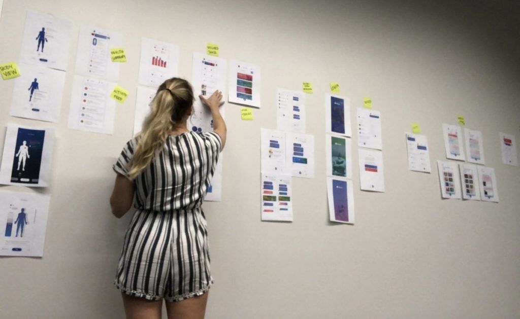
Design team prepping for the meeting by printing out the screens and taping them on the wall
Below are the final hi-fi renditions of the future Merlin Health app.
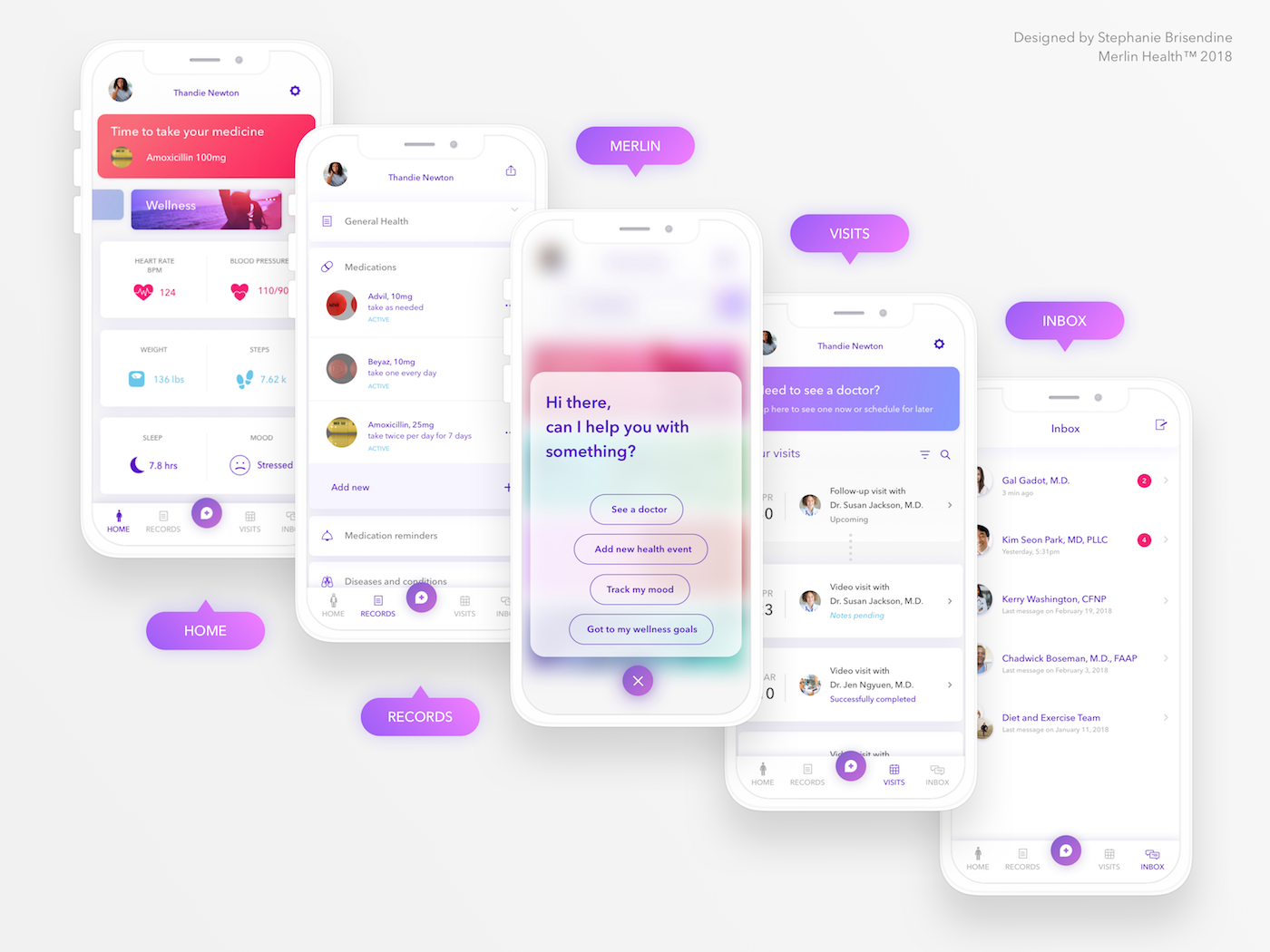
New Navigation & Architecture
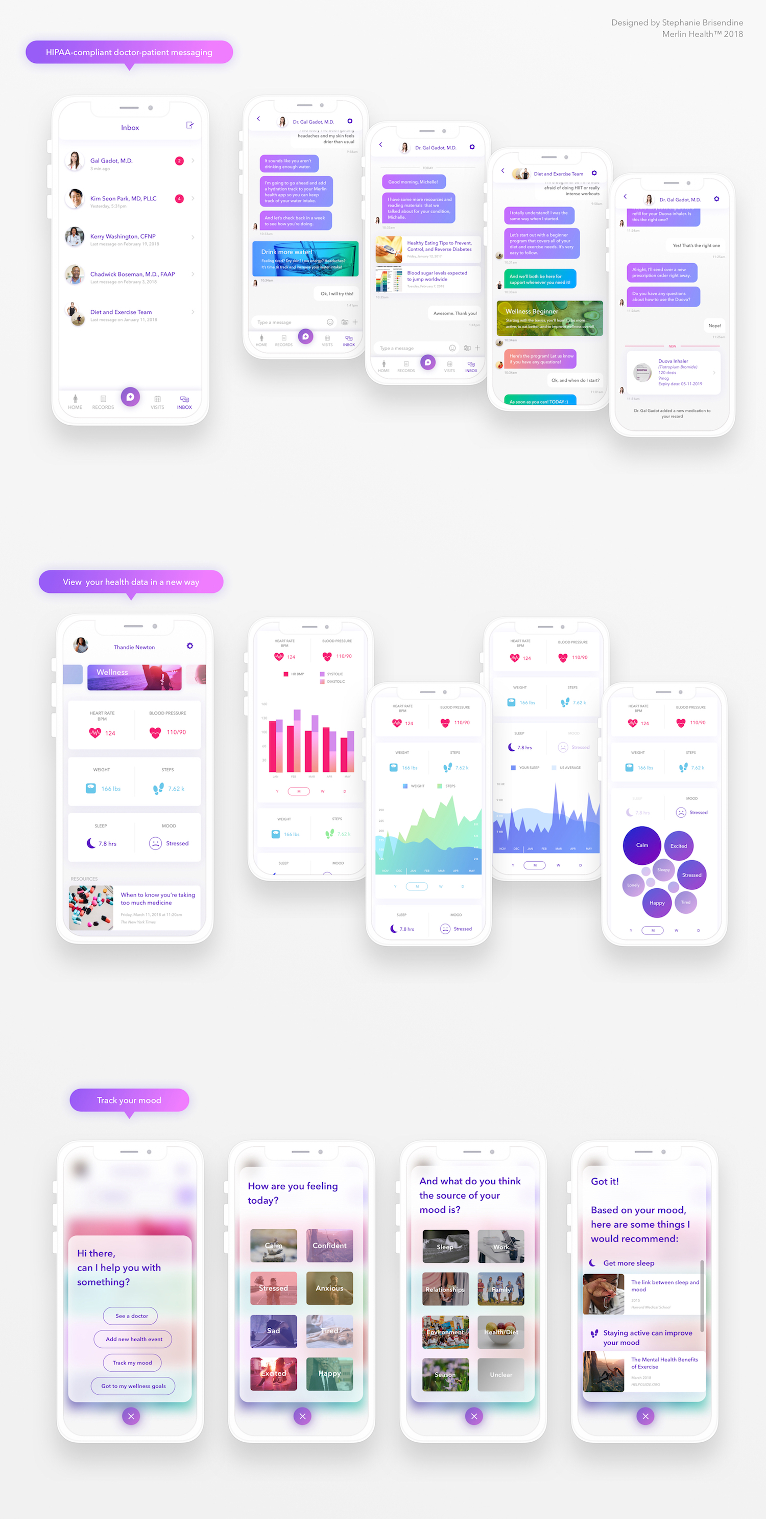
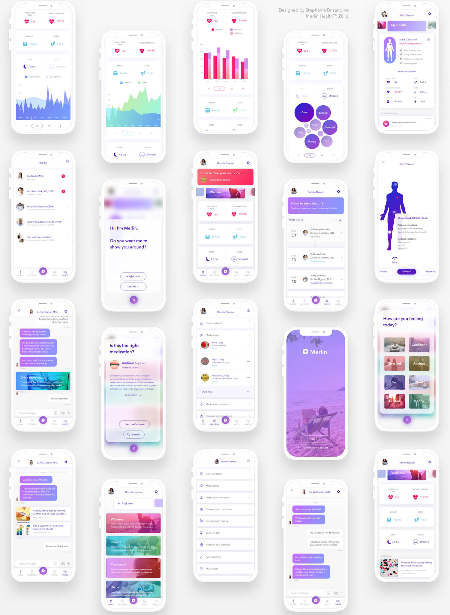
Over 50 New Screens Designed!


SaveSave
Design Team
Robert F. Alvarez, Ajit Vaidya, Janel Rehbein
Date
January 2, 2018
Category
identity, interaction, product, research, user experience